The Role of Color Psychology in Print Marketing
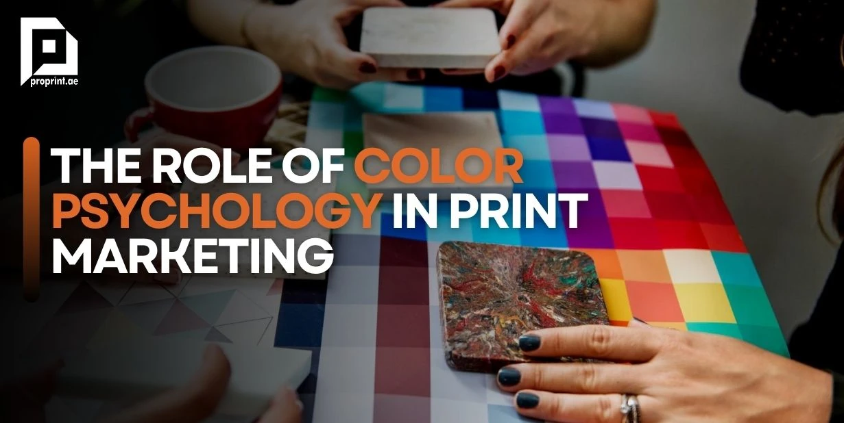
In the vibrant world of print marketing, every hue, shade, and tint plays a pivotal role in conveying messages, eliciting emotions, and shaping perceptions. Among the array of factors that contribute to a successful print campaign, color stands out as a powerful tool deeply rooted in psychology. Understanding the nuances of color psychology can empower marketers to craft compelling designs that resonate with their audience on a subconscious level. In this exploration, we delve into the fascinating realm of color psychology and its profound influence on print marketing strategies.
Unveiling the Psychology of Colors
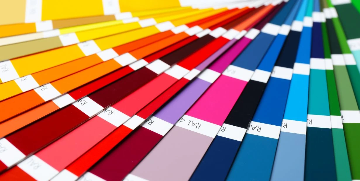
Color psychology, a branch of behavioral psychology, explores how colors impact human emotions, behaviors, and perceptions. It reveals that different colors evoke distinct psychological responses, making them invaluable assets in marketing communications. Let’s delve into the psychological associations commonly attributed to various colors:
1. Red:
- Emotional Triggers: The color red is inherently linked with strong emotions and physical sensations. It elicits feelings of passion, intensity, and excitement. Psychologically, red increases heart rate and stimulates adrenaline production, creating a sense of urgency and energy.
- Applications: In marketing, red is strategically employed to capture attention and prompt action. Whether used in advertising banners, product packaging, or promotional materials, red commands immediate attention and encourages impulse purchases. Its association with passion and urgency makes it particularly effective for promoting sales, limited-time offers, and clearance events.
2. Blue:
- Emotional Triggers: Blue is often hailed as the color of trust and stability. Psychologically, it has a calming effect on the mind, evoking feelings of tranquility, security, and reliability. The sight of blue is associated with clear skies and vast oceans, instilling a sense of peace and serenity.
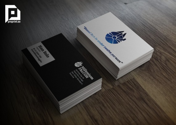
- Applications: Brands seeking to convey professionalism, trustworthiness, and competence frequently incorporate blue into their visual identity. Whether used in corporate logos, business cards, or website design, blue instills confidence and reassurance in consumers. It is an ideal choice for industries such as finance, healthcare, and technology, where credibility and dependability are paramount.
3. Green:
- Emotional Triggers: Green is closely linked to nature and the environment, symbolizing growth, vitality, and harmony. Psychologically, green has a restorative effect on the mind, promoting feelings of balance, rejuvenation, and well-being. People associate it with lush landscapes, fresh foliage, and eco-friendly practices.
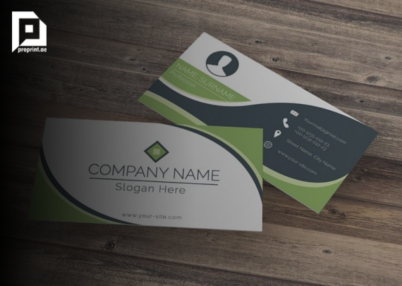
- Applications: Brands committed to sustainability, health, and holistic living gravitate towards green in their branding efforts. Whether marketing organic products, eco-friendly services, or outdoor activities, green communicates a sense of environmental responsibility and connection to the natural world. Green signifies prosperity and abundance, making it appealing to financial institutions and wealth management services.
4. Yellow:
- Emotional Triggers: Yellow is synonymous with sunshine, warmth, and optimism. Psychologically, it stimulates the brain’s pleasure centers and promotes feelings of happiness, energy, and enthusiasm. The sight of yellow instantly uplifts mood and captures attention, making it one of the most attention-grabbing colors.
- Applications: Brands looking to evoke a sense of positivity, playfulness, and creativity often incorporate yellow into their marketing materials. Whether used in logos, advertisements, or product packaging, yellow exudes vibrancy and cheerfulness. It is particularly effective for highlighting special offers, promotions, and call-to-action buttons, as it draws the eye and encourages engagement.
5. Black:
- Emotional Triggers: Black is synonymous with power, sophistication, and mystery. Psychologically, it conveys authority, elegance, and timelessness. The absence of color creates a sense of depth and intrigue, eliciting curiosity and fascination.
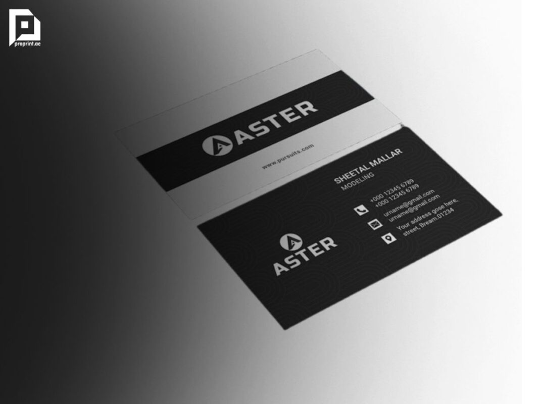
- Applications: Luxury brands and high-end products frequently utilize black in their branding to convey exclusivity and prestige. Whether showcased in fashion, cosmetics, or consumer electronics, black exudes a sense of refinement and sophistication. Favor minimalist design aesthetics, where simplicity and elegance are paramount.
6. Purple:
- Emotional Triggers: Purple evokes a sense of royalty, creativity, and spirituality. Psychologically, it stimulates the imagination and encourages introspection. Purple is often associated with luxury, wisdom, and magic, conjuring feelings of awe and inspiration.
- Applications: Brands seeking to convey sophistication, originality, and spiritual depth often incorporate purple into their branding. Whether used in luxury goods, artistic endeavors, or wellness products, purple captivates attention and fosters a sense of wonder. It appeals to individuals who appreciate beauty, creativity, and self-expression, making it a versatile choice for diverse industries.

Leveraging Color Psychology in Print Marketing
Now that we’ve uncovered the psychological underpinnings of various colors, let’s explore how businesses can strategically leverage color psychology in their print marketing endeavors:
1. Brand Identity and Consistency: Selecting a color palette that aligns with your brand’s values and personality fosters brand recognition and consistency across all marketing materials.
2. Target Audience Analysis: Understanding your target demographic’s preferences and emotional triggers enables you to tailor your color choices to resonate effectively with their psyche.
3. Creating Visual Hierarchy: Employing contrasting colors for headlines, call-to-action buttons, and key elements draws attention and guides the viewer’s gaze, facilitating information processing.
4. Evoking Desired Emotions: Choose colors that evoke the desired emotional response aligned with your marketing objectives. For instance, tranquil blues for a wellness spa or vibrant reds for a clearance sale.
5. Cultural Considerations: Try to make note of cultural connotations associated with colors, as interpretations may vary across different regions and demographics.
Case Studies: The Power of Color in Action
To illustrate the profound impact of color psychology in print marketing, let’s examine a few notable case studies:
Coca-Cola’s Signature Red
- Coca-Cola’s iconic red branding exudes energy, excitement, and passion, aligning perfectly with its youthful and dynamic brand image. The strategic use of red has contributed significantly to Coca-Cola’s global brand recognition and market dominance.
McDonald’s Golden Arches
- McDonald’s strategic use of yellow and red in its branding creates a sense of warmth, optimism, and urgency. The combination of these colors not only stimulates appetite but also reinforces the brand’s message of speed and convenience.
Tiffany & Co.’s Timeless Elegance
- Tiffany & Co.’s signature blue packaging epitomizes sophistication, luxury, and exclusivity. The iconic “Tiffany Blue” has become synonymous with timeless elegance, setting the brand apart in the competitive jewelry market.
Conclusion: Harnessing the Colorful Canvas of Print Marketing
In the realm of print marketing, color serves as a potent language that speaks directly to the subconscious mind, eliciting emotions, shaping perceptions, and influencing behavior. By harnessing the principles of color psychology, businesses can elevate their print marketing strategies to new heights, forging deeper connections with their audience and driving tangible results. As you embark on your next print campaign, remember the transformative power of color and wield it with purpose and precision to leave a lasting impression in the hearts and minds of your audience.

